Got It tooltip
A Got It tooltip informs users about a new or changed feature and gives basic information about it.
When to use
Point to small UI controls that can be missed among other information in the screen.
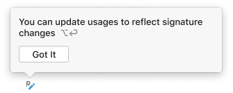
 After method or parameter names are edited, the Inplace Refactoring icon appears.
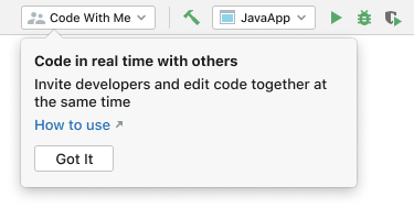 After the “Code With Me” plugin is installed, a drop-down menu appears on the toolbar.
Explain behavior that is not clear from the UI.
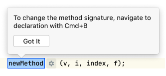 When extracting a method, users can change only the method name in the blue box. The tooltip explains where to change the order of parameters in the parentheses and other properties of a method.
Suggest keyboard interactions.
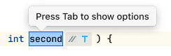 The inlay with options after the blue box is a new control. The tooltip explains how to use it with the keyboard.
Explain how to revert to the old UI in case of significant UI changes.
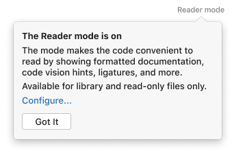
 The tooltip explains how to revert to a new experimental UI. Only users who switched to the new UI can see it.
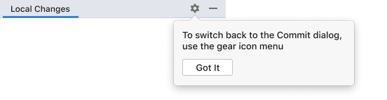
Do not use the tooltip if there is no space to attach it. Instead, use a banner in a dialog or a notification in the main window.
How to use
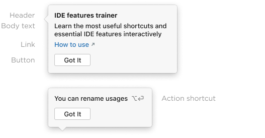
Always add the body text.
Add a header if the body text is 2 lines and more. A short header can quickly explain what this tooltip is about.
Add a shortcut, if the tooltip describes a single action that has a shortcut.
Implementation:
val GOT_IT_TEXT = "Learn the most useful shortcuts and essential IDE features interactively";
val shortcut = ...;
val tooltip = GotItTooltip("ide.features.trainer", GOT_IT_TEXT, project)
              .withHeader("IDE features trainer");
              .withShortcut(shortcut);
Link
Add a local link if users might want to revert changes in a feature or configure it.
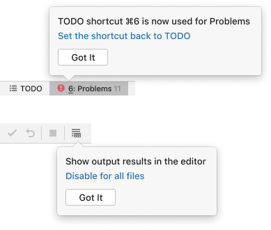
new GotItTooltip("some.id", "Show output result in the editor", project)
    .withLink("Disable for all files", this::actionMethodReference);
Add an external link if there is a help source that can further explain the functionality.
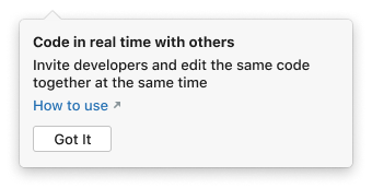
new GotItTooltip("some.id", GOT_IT_TEXT, project)
    .withBrowserLink("How to use", URL("https://www.jetbrains.com/howtouse"));
Do not add more than one link.
Text length and formatting
Show no more than 5 lines of body text. If the text does not fit, leave only the essential information and add a link to a help article.
Use sentence case both for the header and body text, and follow the punctuation rules.
Make the help text short and descriptive.
Avoid using style formatting. It makes the tooltip harder to read.
|
Incorrect 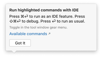
|
Correct 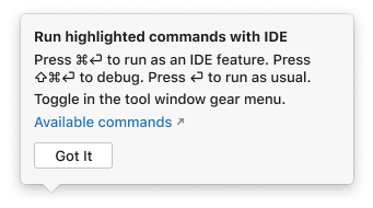
|
Location
Do not cover the information the user is currently working with.
Incorrect
Correct

Implementation. See four predefined point providers in the GotItTooltip class.
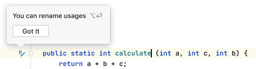
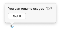
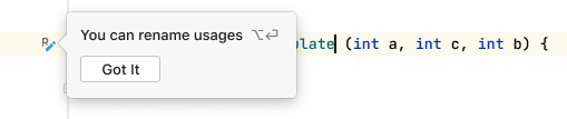
new GotItTooltip("some.id", "You can rename usages", project)
    .show(gutterComponent, GotItTooltip.TOP_MIDDLE)
Timeout
Consider adding a timeout if:
- The text is no longer than 10 words.
- The tooltip appears at the place at which the user is currently looking.
- There is no link in the tooltip.
The Got It tooltip has a timeout because the text is short, the user has just started the Rename refactoring, and is very likely looking at this place.
Note that adding a timeout automatically hides the Got It button.
Implementation. Default timeout duration is 5 seconds. A custom duration can be set:
new GotItTooltip("refactorings", "Press Tab to show options", project)
    .withTimeout(3000)
Versioning
If a tooltip appears automatically after the IDE starts, tie it to the IDE version. Due to the technical limitations, tooltip counters might be reset when the IDE version is updated, and the users might see the same tooltips again.
If a tooltip is triggered by an action or plugin installation, do not tie them to the current IDE version. In this case, users might miss a tooltip if they are using this functionality or plugin for the first time in the next IDE version.
Built-in behavior
By default, a tooltip is shown only once per user.
The tooltip disappears when:
- Esc is pressed
- User clicks any place outside the tooltip
The default timeout duration is 5 seconds.
If several tooltips appear on application start, they are shown one by one.
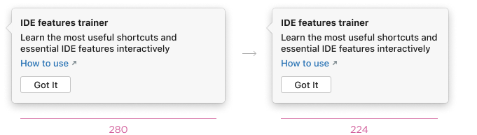
Text width is 280 px by default. The tooltip width adjusts automatically to make the right margin 16 px.