Icon button
A toolbar icon button is an icon that appears on a toolbar.
Types
There are three types of toolbar icon buttons:
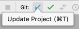
An action button triggers an action immediately on clicking it, e.g. the Open button.
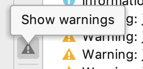
A toggle button switches the state on clicking it, e.g. a button to show and hide warnings in the output tree.
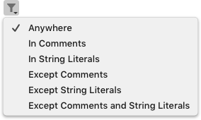
A drop-down button has an arrow icon in the bottom right corner and opens a menu with actions or checkboxes. Use
menu list guidelines for drop-down buttons.
When to use
Follow the rules for toolbar.
How to use
Provide a recognizable icon. Use an existing icon or create a new one using icon guidelines.
Provide a short and descriptive name for a toolbar icon button. Show a tooltip with the button name on mouse hover. Include a shortcut if there is one. See Context help for details.
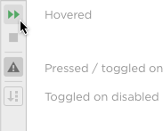
Highlight a toolbar icon button on mouse hover. Highlight a toolbar icon button with a brighter color on clicking it.
-
Toggle buttons remains highlighted when they are in the switched on mode. Toggled on buttons do not change color on hover.
-
Drop-down buttons remain highlighted while the menu is opened.
If an action is not available in this context, disable the corresponding button and gray out the icon. For toolbar drop-down buttons, disable the arrow icon as well. Do not highlight a disabled icon on mouse hover.
Sizes and placement
Icons size is 16x16 px, icon selection is 22x22 px.
For guidelines on the space between toolbar icon buttons see Toolbar.