Link

When to use
Use a regular link for navigation between pages of the same window.
 This option is in the Settings dialog. “Configure servers” opens another page of the same dialog.
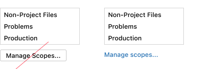 Do not use a button to navigate to another page of the same window.
Use an external link for navigation to web resources. See below for the external link icon.

Use a regular or drop-down link for secondary actions in packed or small UI areas.
 The “Reset” action is a link for two reasons: (1) The action appears only when the default value in the field is changed and reverting to a default is considered a rare scenario. (2) A lightweight link fits better than a button in this busy layout.
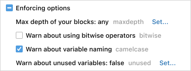
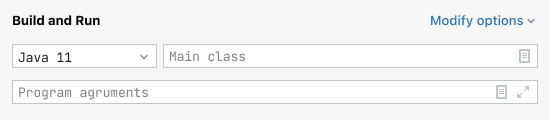 The “Modify options” drop-down link fits into the top right corner of a busy layout.
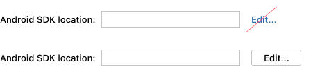
Do not use links for primary actions or when a UI is not constrained. Use a button or a drop-down list instead. These controls can be selected from the keyboard and are bigger and easier to click.
How to use
Writing guidelines
Use sentence capitalization.
Add an ellipsis to a button-link if it opens another UI area where input is possible. See examples for the Button.
Do not use words like “navigate” or “click here”. A link already implies navigation or clicking.

When possible, replace “Learn more” and other generic phrases with more informative ones.

Link as a part of text
A link can be a part of a checkbox or radio button label or of any stand-alone text, like text in an empty state or in context help.

Make a link the minimum phrase that is enough to understand what will happen without reading the whole text.

Link in a tree or table
Use a link as a secondary action for some items of a tree or table.
If an action is needed for all items of a tree or table:
- Add an icon button to a toolbar.
- For a list of choices, add a separate table column of drop-down cells (see Table).
- If a link in every tree or table line has meaningful formatting, leave it:
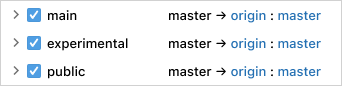 Links in the “Push Commits” window have the format that helps understand the relation between them: “[remote repository] : [branch]”. Moving these links elsewhere would break this meaning.
External link icon
Always add the arrow icon for an external link. The icon shows that the user will switch to a browser and lose the current context.
ActionLink externalLink = new ActionLink("External link", event -> {
    BrowserUtil.browse("http://google.com");
});
externalLink.setExternalLinkIcon();
An exception is a help topic link in empty states. The help icon already hints that this is an external help resource so the arrow icon is unnecessary.
Drop-down link
Drop-down links show a context menu or a popup. Use com.intellij.ui.components.DropDownLink to implement a drop-down link.
Placement
Lay out button-links as buttons and dropdown-links as combo boxes. See Layout.
Built-in behavior
A focused link is activated from the keyboard with Space.