Platform theme colors
There are two default color themes: IntelliJ Light and Darcula.
Use the colors consistently within the default themes. To do so, follow these guidelines:
- Icons In the article about icons
- UI components
- Editor scheme TBD
- Charts TBD
UI components
Colors for UI components are specified with color keys. A color key is a name of a color property in a particular component, e.g. ComboBox.background, or a generic color property for several components, e.g. Component.borderColor.
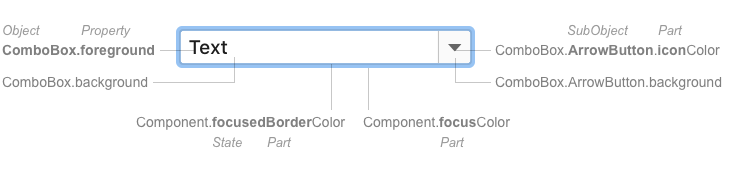 Color keys of a combo box
Each key has two default color values: one for IntelliJ Light and another for Darcula. Example: ComboBox.background is #FFFFFF in IntelliJ Light and #3C3F41 in Darcula.
Keys allow creating custom color themes. A custom theme is one of the default themes plus a set of color keys with new values in a JSON file. Example: the High contrast theme is a custom theme based on Darcula. New color values are stored in the JSON file.
See the meanings of the parts in a color key in the key naming scheme.
See a complete list of keys with their descriptions in the JSON files: IntelliJ custom keys, JDK keys.
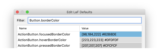
See the color values for the currently selected theme in the LaF Defaults dialog:
- The dialog is available in the internal mode. See Tools > Internal Actions > UI in the main menu or find it with Go to Action.
- Some color keys are not shown in the dialog by default because they are loaded at runtime with a corresponding UI component. Open the UI with this component to see such keys in the dialog.
- Edit a color in the dialog to preview it in the IDE. The edited color is stored until the theme is switched.
If a color is needed:
- Choose a color value for all default themes:
- Try reusing any of the existing colors first. Use the LaF Defaults dialog to see the existing colors.
- If none of them fit, choose two new color values that are consistent with IntelliJ Light and Darcula palettes in hue and contrast.
- Choose a color key if a component does not have it:
- Use an existing color key if it fits semantically. Otherwise, a UI component might get an unexpected color in a custom color theme.
- Create a new key if none of the existing ones fit semantically. Follow the naming scheme.
Example:
Incorrect: A new component with a light-blue background reuses Focus.borderColor which has a light-blue color in the default themes. A theme author decides they need a bright focus border and changes the color value for Focus.borderColor. As a result, the new component has a bright background with the text unreadable over it.
Correct: A new component with a light-blue background has its own color key ComponentName.background.
Implementation
Use JBColor.namedColor to set a color key and fallback color values:
private static final Color SELECTED_BACKGROUND_COLOR = JBColor.namedColor("CompletionPopup.selectionBackground", new JBColor(0xc5dffc, 0x113a5c));